Breakfirst brand
The mark, the wordmark, how they are built, how to use them and why they look like this. The files are listed at the end of the page.
The mark
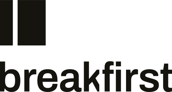
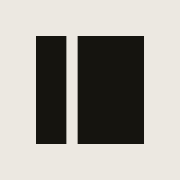
A block of 48 units with one gap, 5 units wide, centred on the first third of the width. The faces of the cut are parallel. The corners are square. Nothing else.
It is a test specimen that has been broken on purpose, in one place, early. The same plane opens in the object on the home page. In interfaces and documents the lockup carries the identity; the square on its own is for the favicon, the footer and the social image.
The wordmark
The name set lowercase as one word in Archivo SemiBold at normal width, kerned by hand and converted to outlines. One bespoke detail: the kerf. It is the same width as the gap in the mark and cuts straight through the junction of break and first, taking the end of the leg of the k and the left end of the crossbar of the f.
The cut forces the reading break, first. In running text the name is Breakfirst, capitalised, with no cut.
Lockups
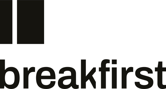
Horizontal for headers, documents and any space wider than it is tall. Stacked for square and portrait spaces. In both, the mark stands at the ascender height of the wordmark so the two share a top edge and a baseline.
The gap in the mark and the kerf in the wordmark are the same width at every size.

Clear space
Keep a zone equal to the width of the narrow piece of the mark clear on all four sides. For the lockups, use the narrow piece at that scale. Nothing enters the zone: no type, no edge of a page, no other mark.
Minimum sizes
Below these sizes the kerf closes up. Use the mark alone, and use the pixel-snapped favicon files for anything under 32 px.
| Asset | Screen | |
|---|---|---|
| Mark | 16 px | 4 mm |
| Wordmark | 80 px wide | 20 mm wide |
| Horizontal lockup | 120 px wide | 30 mm wide |
| Stacked lockup | 72 px wide | 18 mm wide |
Colour
Black on studio grey or white. White on black. Nothing else. The mark never sits on a photograph, a gradient or a colour.
The stress spectrum is reserved for two meanings: the load on the object and the severity of a finding. It never touches the mark or the wordmark.
Misuse
Each of these changes the one idea or adds a second one.
Do not colour it. The spectrum belongs to the object and to severity.
Do not centre the gap. It becomes a pause glyph.
Do not widen or narrow the gap.
Do not rotate it. The break is vertical.
Do not outline it.
Do not put it in a rounded square or any container.
Do not add shadows, gradients or any effect.
Do not mirror it. The break sits one third from the left, where a timeline starts.
Do not use it at icon size beside interface controls, where it reads as a sidebar toggle. Use the lockup.
Do not stretch it. It is square.
Rationale
Why it looks like this, in 150 words.
Everything breaks. A test lab does not pretend otherwise. It decides where and when. The Breakfirst mark is a solid block with one clean break, cut at the first third of its width. The block is the specimen: the cube that is crushed so the structure never is. The gap is the service: a controlled break, made on purpose, before anyone else can make it. Its position is the promise. It sits early, at one third, where the timeline still has room to recover, not at the centre, where a break would read as a pause. The faces of the cut are parallel and square because the failure was planned, not suffered. The same kerf runs through the wordmark between break and first, so the name performs the service and cannot be misread. In the hero, the object breaks along this exact plane. One idea, carried everywhere, always in black.
Files
All files live in the brand folder of the site and are generated from one geometry source, so they never drift apart.